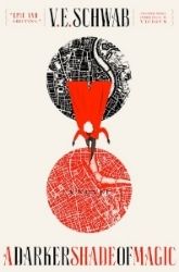
There are always two version's to a cover, but in this post we are putting the
US and the UK head to head to see who comes with the best cover.
Our contestants are...
US-UK
And I prefer the US one. This is from Mellissa's website:
"My lovely British publisher Atom books just sent over the cover for KEYS TO THE REPOSITORY. A bit different from the US cover since the books are just being introduced to the UK market now, and Atom felt it would be good to have the city nightlife and our lovely heroine featured in the cover."
In my mind our lovely heroine doesn't look like that. The girl looks kinda creepy to tell you the truth Lol I like the US because this book is suppose to be like a manual to the series, and I think the US cover is very good for that type of book. We are looking INTO the series, to the secrets and all that stuff. And the UK is just so dark, not what I would expect after all the other covers.
...did I mention the girl creeps me out?

 -♥-
-♥-
 -♥-
-♥-
 -♥-
-♥-
 -♥-
-♥-
 -♥-
-♥-
 -♥-
-♥-
 -♥-
-♥-
 -•
-•


.jpg)


I definitely agree with you! The US cover looks like a guide but the UK cover looks like it is a new Blue Bloods book just like the others in the series. I also don't like the cover model, especially if that is supposed to be Schuyler.
ReplyDeleteI agree. The girl is a bit creepy. I like the US cover more for sure.
ReplyDeleteI think she has been airbrushed WAY to much..lol I like the US cover sooo much better.
ReplyDeleteI prefer the cover without the girl as well - it definitely grabs more of my attention.
ReplyDeleteI love the US cover better too..the girl on the UK cover seriously freaks me out too!! But I quite like the back cover of the UK one :)
ReplyDeleteUS for me too Taschima!
ReplyDeletereally? i find the eye in the us one kinda creepy, i get what you mean about the girl tho , but im probs goin with the uk one, i havent heared about this book until now,and i love her work, thanks for posting this up! :)
ReplyDeleteI like the US better, as well.
ReplyDeleteAre you sure that it's gonna be a manual/guide kinda book?Because at the end of The Van Allen Legacy it says that KTTR includes "deleted scenes,short stories and secret correspondence from the world of the Blue Bloods".I sure hope it'll be a guide though, because the story is getting more perplexed and is filled with details you've got to remember.A guide would be very useful right about now :)
Even though I think both covers are beautiful, I agree with you about the US cover being better for the book than the UK version. I haven't read all of the books in the Blue Bloods series, but I did read half of the first book and own the first three. I'm really looking forward to reading them as I've had them on my TBR list for a while and always go nuts when a new book comes out because of it's beautiful covers.
ReplyDeleteAs many have said, the first book looks more like a guide and holds mystery, as the second one looks like just another Blue Blood installment.
Great post! I always love comparing the different covers and titles of the same book from across the world. :) It's always fun to see.
@AtenRa Well I think it does include that also! I don't know if calling it a manual now is pretty limiting... But I don't know what other word to give it lol
ReplyDeleteI think that the UK is ok. But that is so not what I think Schuyler looks like!
ReplyDeleteI agree. I like the US cover much better. I'd pick it up, just to find out more. But the UK one I might well leave on the shelf.
ReplyDeleteThe US cover is waay better. It looks like it has more to do with keys, with the whole key hole thing. The UK cover looks really weird, and the girl on it kinda freaks me out.
ReplyDeleteFor once I like the US cover the best. It's pretty and intriguing!
ReplyDeleteI believe that the girl on the UK cover looks creepy, that's what I said before I read you said the same thing.
ReplyDeleteThe US cover is worlds better. I agree the girl on the UK cover does look kinda creepy and nothing what I pictured her to look like. The US cover implies a mystery or secret to be revealed or found.
ReplyDeleteI totally agree with your choice U.S. all the way. And is it just me or does "our lovely heroine" in the UK cover look like a possessed Bratz doll? Kinda creepy my votes for US I like the aloof appeal of looking through a keyhole.
ReplyDeleteI also prefer the US version. I hate how some on some covers they just put a girl on it who looks vaguely similar to the character and just call it a day. The US is creepily cool and mysterious while the UK one is just plan creepy.
ReplyDeleteUS! Much better...I don't like the creepy girl on the cover of the UK.
ReplyDeletei like both, i don't know anything about the book's plotline, so i don't know which could be the best!
ReplyDeleteYikes! The girl creeps me out too! Bug eyes or something.
ReplyDeleteThere's just something about that girl that's kind of creepy. I'm picking the US cover!
ReplyDeleteI like more the US cover more!!
ReplyDeletecan't wait to read it
ReplyDeleteI like the one with the keyhole. It is more mysterious...
ReplyDeletekghobbs(at)gmail(dot)com