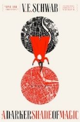

US-UK Hardbacks
I have a thing about the UK edition. It does look like a simple cover made for a 1.5 novella, but it also manages to be so beautiful in it;s simplicity. It's the winds, the font, and the exquisite color. The US edition is interesting, but the black and white person freaks me out. It doesn't look as clean as the UK one does that's a given! Though the font of the US cover is also to die for I would have to vote UK for the hardbacks.
UK-01 US-00


US-UK Paperbacks
This is NO competition! Look at that beautiful red door! First time I saw it I completely fell in love. The door is important to the story, and doesn't it remind you a little of Harry Potter in a way? The color texture, the red of the door... It's something. And look at the hand print!!!! Though I was imagining it being on the door but still, it's there! Love it, love it, love it. The US cover, well, a variation on the first cover and the mask does have something to do with the story, but still have you seen the red door?!
UK-02 US-00


US-UK Hardback
I love them both. You can't make me choose!
UK-03 US-01
UK was going to be win anyways. They had some kick ass editions!


 -♥-
-♥-
 -♥-
-♥-
 -♥-
-♥-
 -♥-
-♥-
 -♥-
-♥-
 -♥-
-♥-
 -♥-
-♥-
 -•
-•


The one with the red door is so beautiful so I had to buy that version!
ReplyDeleteI completely love the UK ones :D The UK covers always relate more to the story and the book, rather than to please the audience. Girls would love the mysterious masked girl in a dark, sparkly cover, but avid book readers would appreciate the red door + handprint ones, hehe :D
ReplyDelete