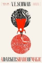
When I first laid eyes on it I just couldn't breathe. Is this what the world has come to? Let me go on a rant here.
- It is plain.
- What's with those colors?! It's like, yellow, and that weird peach that borders on reddish... It makes my eyes want to drink heavily and then jump off a building just to see which hurts more, the dying or looking at this cover for more than a second.
- We have come a long way in book covers, this looks like a cover of a book made in the 70s. The colors remind me of the 70s.
- It has no real artistic flare, it's boring-bore-bore.
- What's with the X?
- At least the book's name goes a bit with the cover, if you focus on the vacant part (it has a vacancy in artistic drive).
- You bother me cover, you really do.
- I know you are trying to stay away from being associated with HP, but this is cover suicide!!
Please let this not be the FINAL cover, and just a vicious prank.
Sincerely,

I'm sorry, did not mean to be hostile, but I really don't like it T__T

 -♥-
-♥-
 -♥-
-♥-
 -♥-
-♥-
 -♥-
-♥-
 -♥-
-♥-
 -♥-
-♥-
 -♥-
-♥-
 -•
-•


I don't like it either. Actually I hate it too. I thought I was the only one. With all the money they have, they could have come up with anything better. It just so...ugly.
ReplyDeleteBut I'll still read it. I loved Harry Potter can't wait to see what she does next. :)
Uh, I don't like it either, it has nothing going for it, I think the publishers are just assuming everyone will read it because they love/have heard of Harry Potter so it doesn't matter what the front looks like
ReplyDeleteTrue, it looks like a cover straight out of the Seventies. I wonder if this might be intentional... but even if it is, it's still an ugly cover. Couldn't they make a bit more of an effort?
ReplyDeletethat is some serious cover suicide. It would be okay if it was an ARC, but... as a final cover? O.o
ReplyDeleteIt doesn't even make me want to pick it up. At all.
I don't like the colors either...it reminds me of McDonalds.
ReplyDeleteIt does suck doesn't it? It feels like a big fat joke, or some kind of social experiment. Maybe they are testing to see how much people will say they love it just out of sheer love for J.K Rowling and then a few months or weeks down the line they will come out with a big JUST KIDDING and show us the real cover. I seriously hope someone at Little, Brown with common sense will go. "Guys, really? No, fix this crap."
ReplyDeleteThe only thing I can get from this cover is that it might be an election ballot? That's why there is an x? to mark who you or voting for but the colours make no sense and it's still hideous.
I think this is one of the ugliest covers I have ever seen. If it wasn't JKR, then I honestly doubt anyone would pick it up if they were browsing in the book store. Or maybe they would, if they were Agatha Christie fans. Maybe I've just been spoilt by awesome YA covers...
ReplyDeleteI think the X is for the voting card. :)
I'm not into the cover either. I think (like Mist in the comments before me) that they're just being lazy with the cover design because of who the author is. But gahhh, why does it need to be so BORING? Like, I'm all for simplistic covers but give me something that I can look at with quiet contentment, not something that makes me go "Am I looking at something my grandma read when she was a teen?" Meh. This cover needs a redo!
ReplyDeleteThe really scary thing is that JK undoubtedly had a hand in approving/designing this. I mean, I'm sure it has some thematic significance to the plot etc etc, but I had to go stare lovingly at my first run HP hardcovers just to get the bad taste out.
ReplyDeleteisn't the book about a councilman that dies, or something? I kind of figured the X was a political thing...like a voting ballot, but I'm not sure. I don't mind it. It's very plain, but hey, I'd read whatever JK wrote!
ReplyDelete-Lauren
Wow... that is a really disappointing cover.
ReplyDeleteWow, really? This is awful.... I'll still read it, but this is truly a horrible cover.
ReplyDeletei'm so with you on this one!
ReplyDeleteI'm sure the cover is absolutely intentional and very calculated to send a message that this is adult literary fiction. I'd bet anything that it was designed by a high-end graphic artist and the handdrawn fonts are supposed to read "quirky" and "smart." The covers for literary books are very different from the eye-candy for young adults.
ReplyDeleteAlso, I think it's ugly.
Not going to lie, I thought it was a fake when I first saw it.
ReplyDeleteHave you read the blurb? It sounds like a snoozer. I think the cover matches it: boring. I won't be picking up Rowling's new title simply because it didn't interest me to begin with. And the cover will definitely keep me away from it. I have no doubt it'll sell well but considering it's such a huge departure from the fantasy she's used to I'm wondering how her writing will compare.
ReplyDeleteI don't mind it. I think it fits the book. *shrugs* It's minimalist and it's going for that kind of classic look - establishing itself as old and awesome before it even comes out.
ReplyDeleteThough I'm not interested in reading it.
I felt the same way about The Fault in our Stars.
ReplyDelete