How can March be already here? Just as well, that means it is only 2 more months until BEA (Book Expo America) and that is something I am REALLY looking forward to!
 |
| I am currently reading Death Sworn and it is an intriguing title that reads like a breeze. I love that stunning cover and can't wait to finish it off (halfway through). Release date: 3/04. |
3/04 - 3/25 - 3/18
Cover winner: Elusion
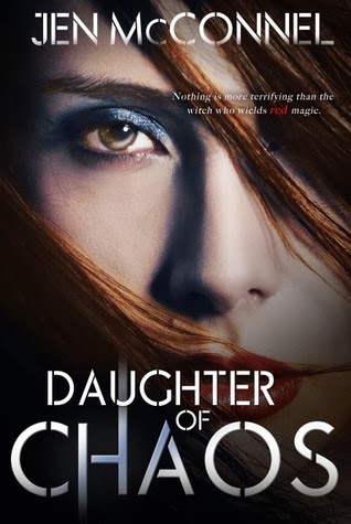
I love Dangerous' simplistic cover, and Daughter of Chaos has by far the best play on font but Elusion is much more eye catching. It is a cover that would make me stop and stare if only to figure out what is exactly it is going on in there (a bit overcrowded maybe?).
3/04 - 3/11 - 3/04
Cover Winner: Let the Storms Break
I LOVE this cover! So reminiscent of Let the Sky Fall while still being original and eerie. I love the sky and how blue it is, as well as the couple in the exact middle watching each other's back. Half Bad and Into the Dark are really strong contenders too. I like Half Bad's play on blood intertwined with the words and the face that appears. Into the Dark's cover reminds me of a Divergent cover but it is still very good.
3/11 - 3/18 - 3/25
Cover Winner: Maybe Someday
I just love how the colors in this cover just pop, also the way they play with the font may be my favorite part. I like Nearly Gone's font even though the half picture of the girl says nothing to me, and I like how Liv Forever looks so simplistic and spooky but they can't top Maybe Someday.
3/04 - 3/04 - 3/11
Hands down, Panic wins. I have read the title and it is great (reminds me of Lauren Oliver's debut title Before I Fall) though I am not sure the cover does represent anything that goes on it is still quite brilliant. I like the hair and the image is so crisp. NIL's cover is very neat in that the title is half submerged in the water. I like how the black feathers look in Promise of Shadows, and I also like the play on the font even though I have to say it might be a tad hard to read (I like how the title seems to rest on the feathers and how the feathers kind of embrace it).
3/01 - 3/06 - 3/04
Cover Winner: The Winner's Curse
A great take on the pretty girl in a dress. I enjoy how the picture is from above and how the font is vertical (I also like the font's simplicity). The Madness makes it clear we are in for a siren title but other than that it is just too quiet, and Searching for Beautiful has a great model in the cover (I like how the hair is on the model's face) and a great palette of colors.
Out of all of them I would have to say my favorite would have to be The Winner's Curse, hands down. It is just so pretty, elegant, simple yet complex. I can't wait to read the title once I am done with Death Sworn!


 -♥-
-♥-
 -♥-
-♥-
 -♥-
-♥-
 -♥-
-♥-
 -♥-
-♥-
 -♥-
-♥-
 -♥-
-♥-
 -•
-•


I like The Winner's Curse cover too. I really want to read this one. Panic was a great book, but the cover doesn't do it justice. The Madness looks intriguing.
ReplyDelete